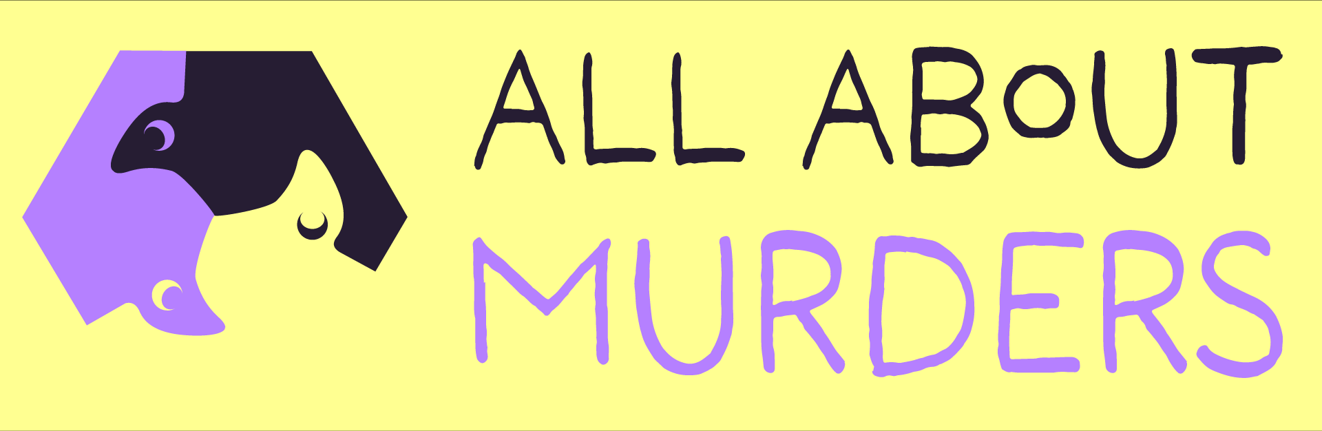
All about murders
Brief: Rebrand the up-and-coming podcast Crow and Tell, to All About Murder by creating a new logo, podcast template, environmental graphics, and a design for a poster for a National Geographic/ Disney Plus series based on the podcast called Secrets of the Murder: Crow Chronicles.
Tools: Photoshop and Illustrator.
The brand's old logo, provided by Matt Olin
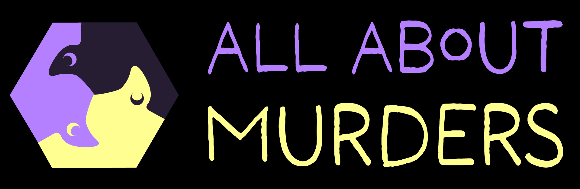
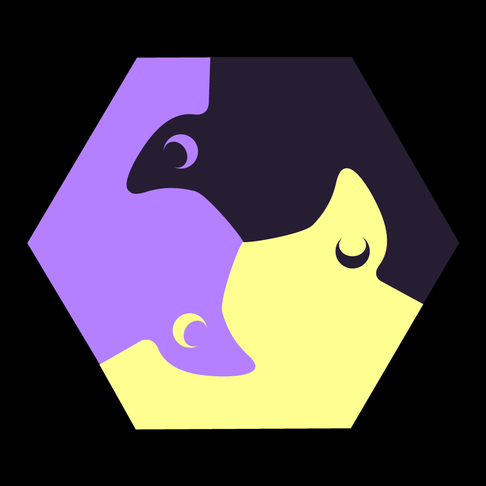
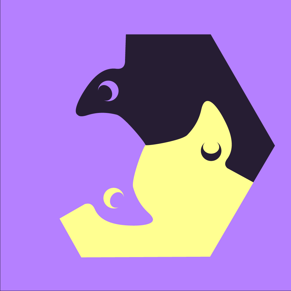
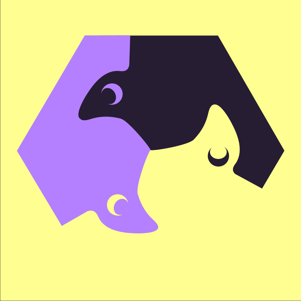
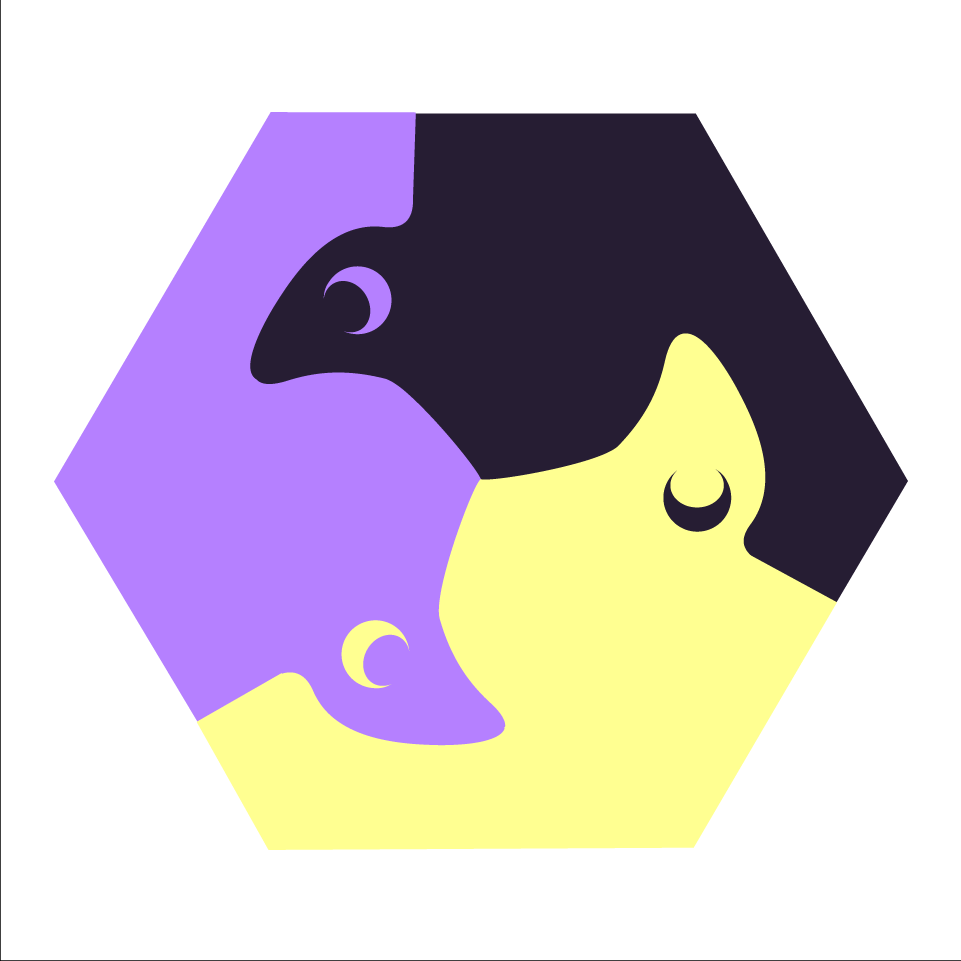
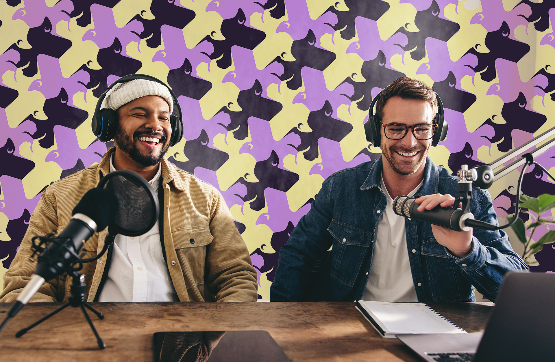
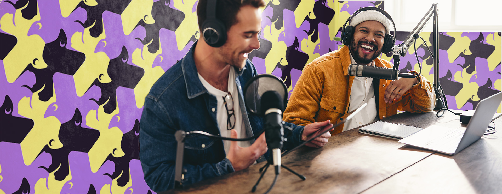
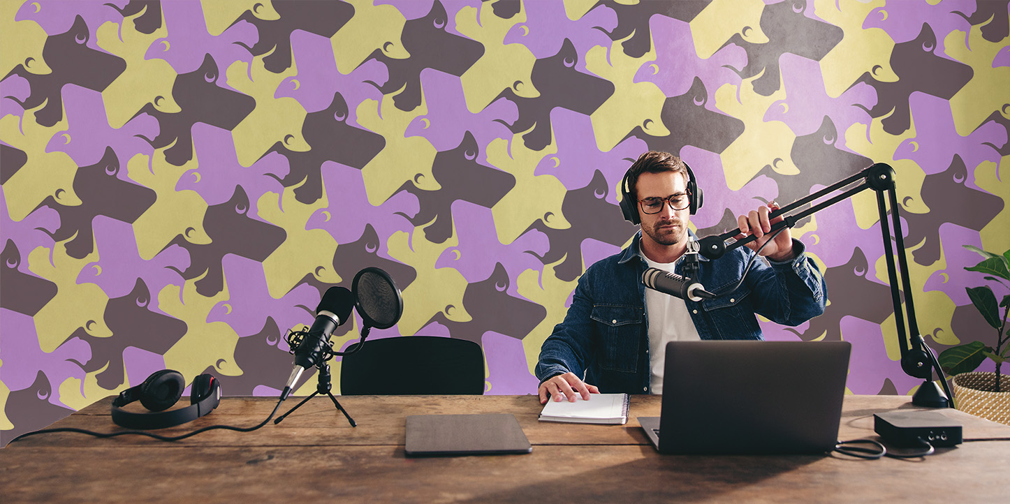
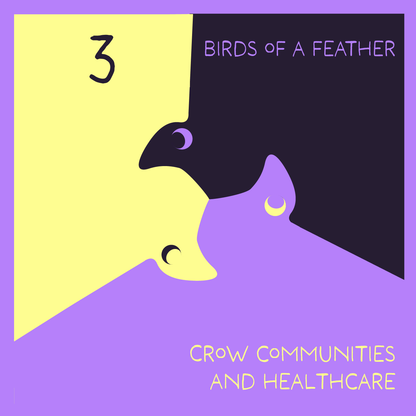
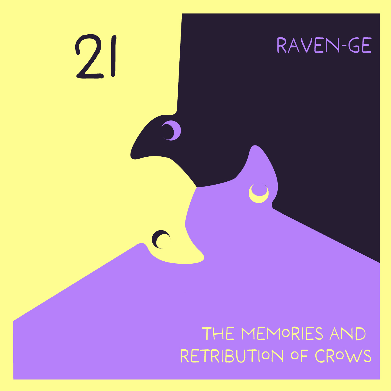
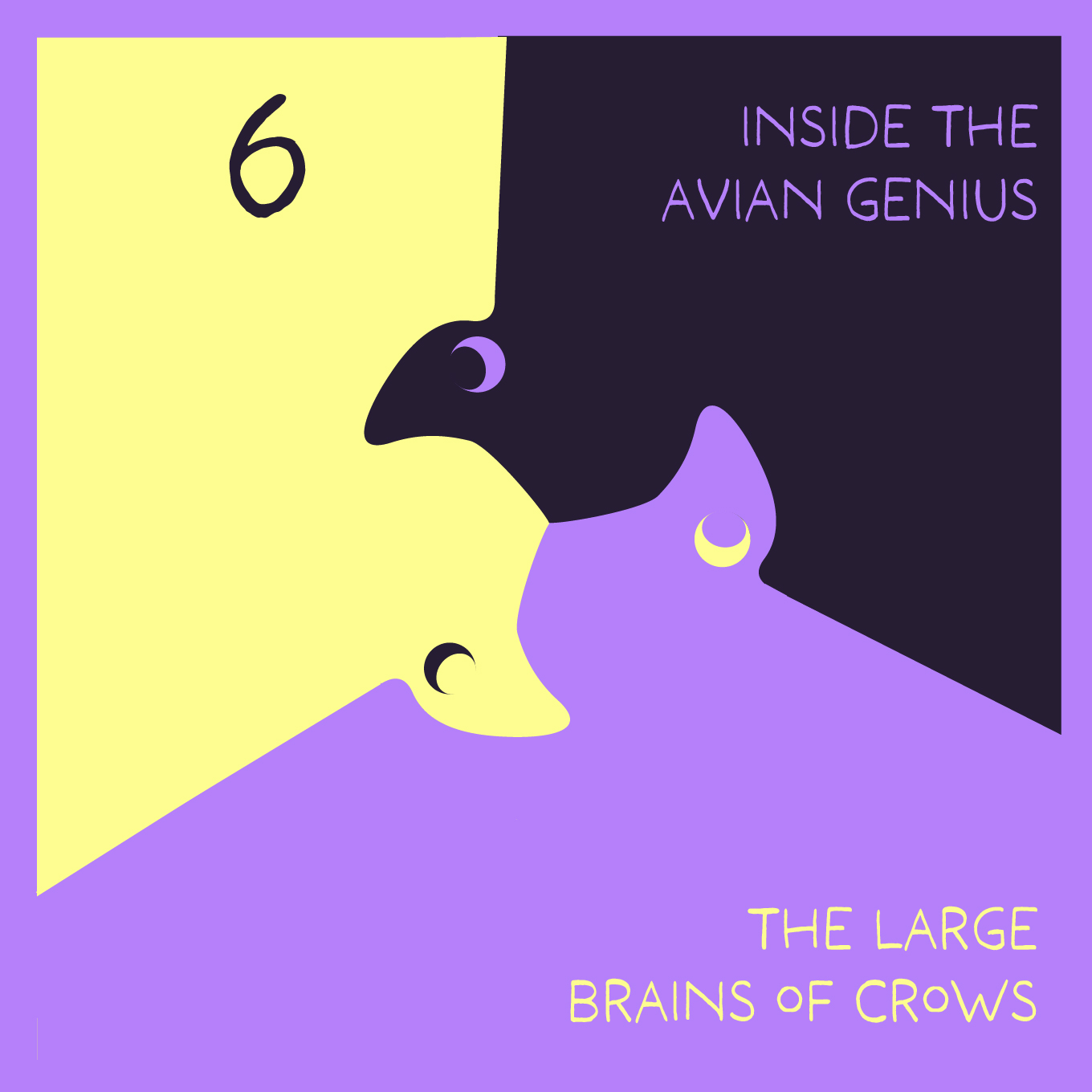
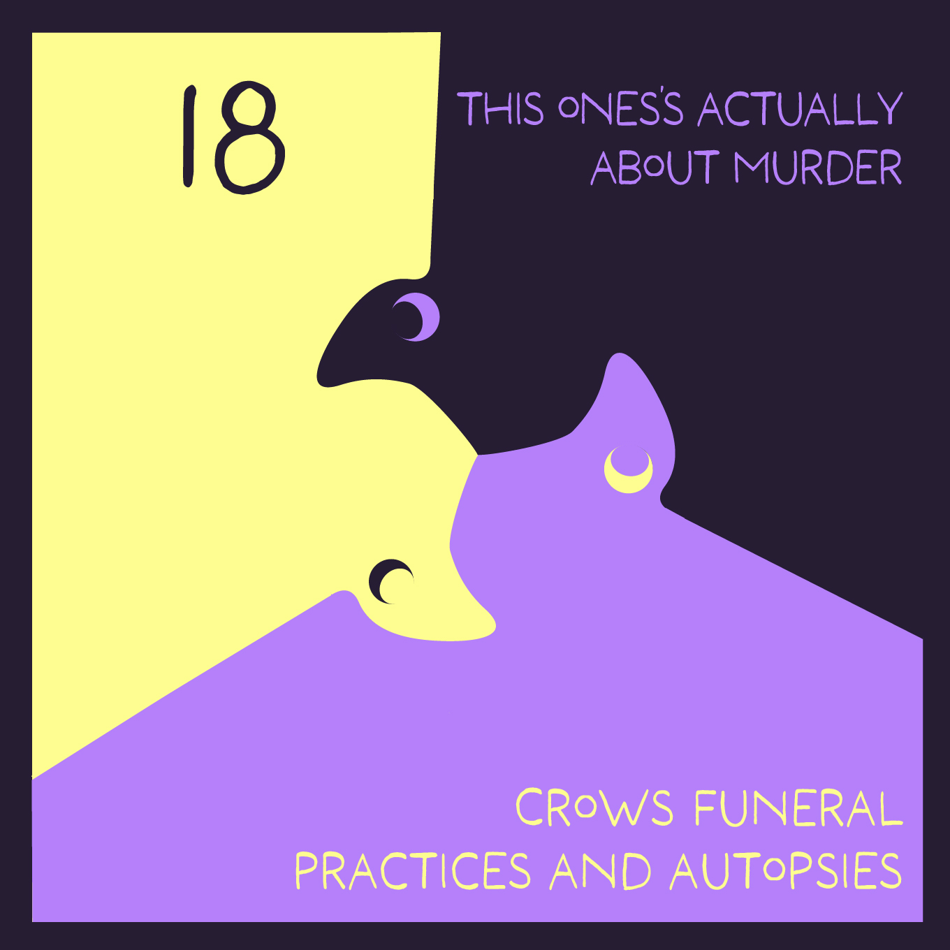
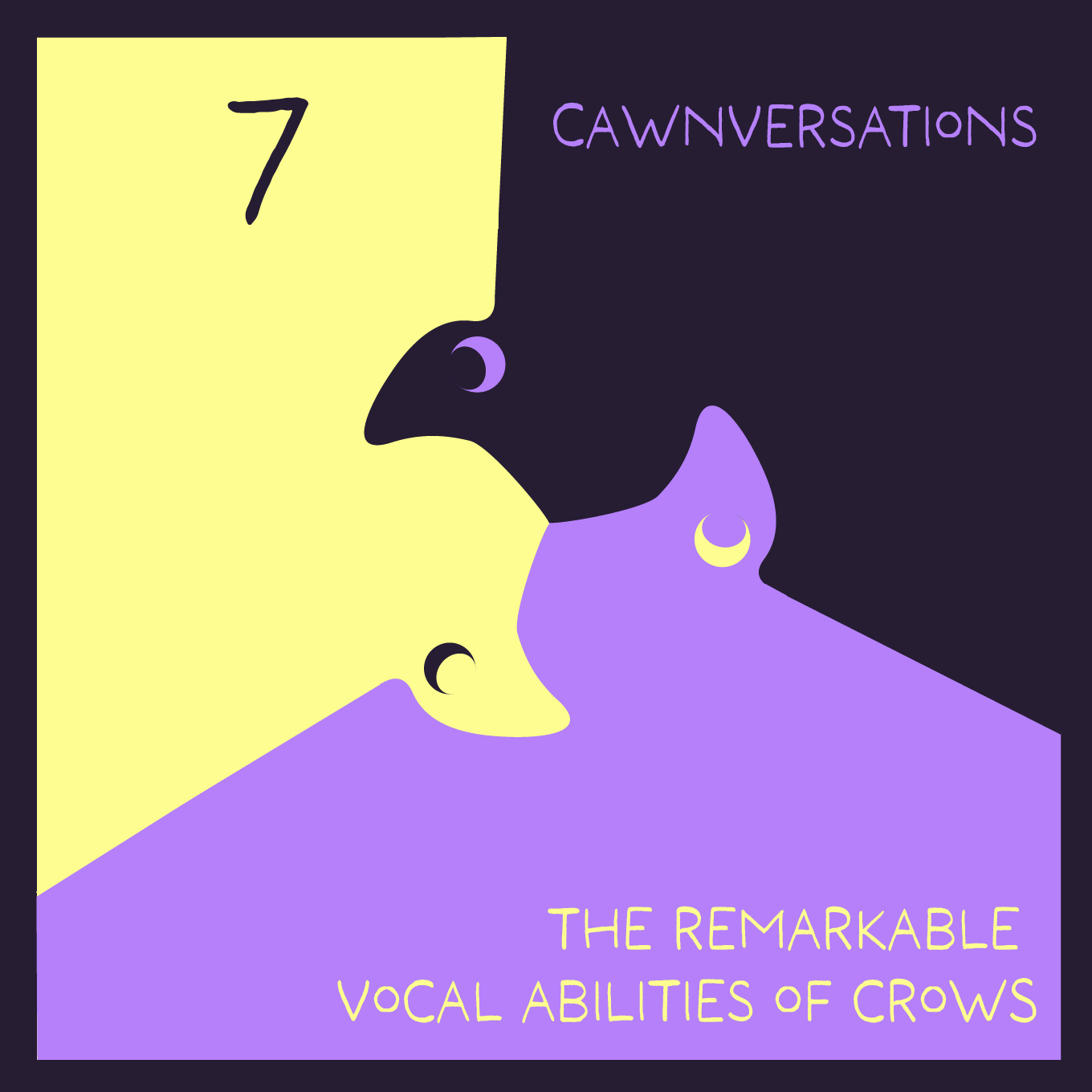
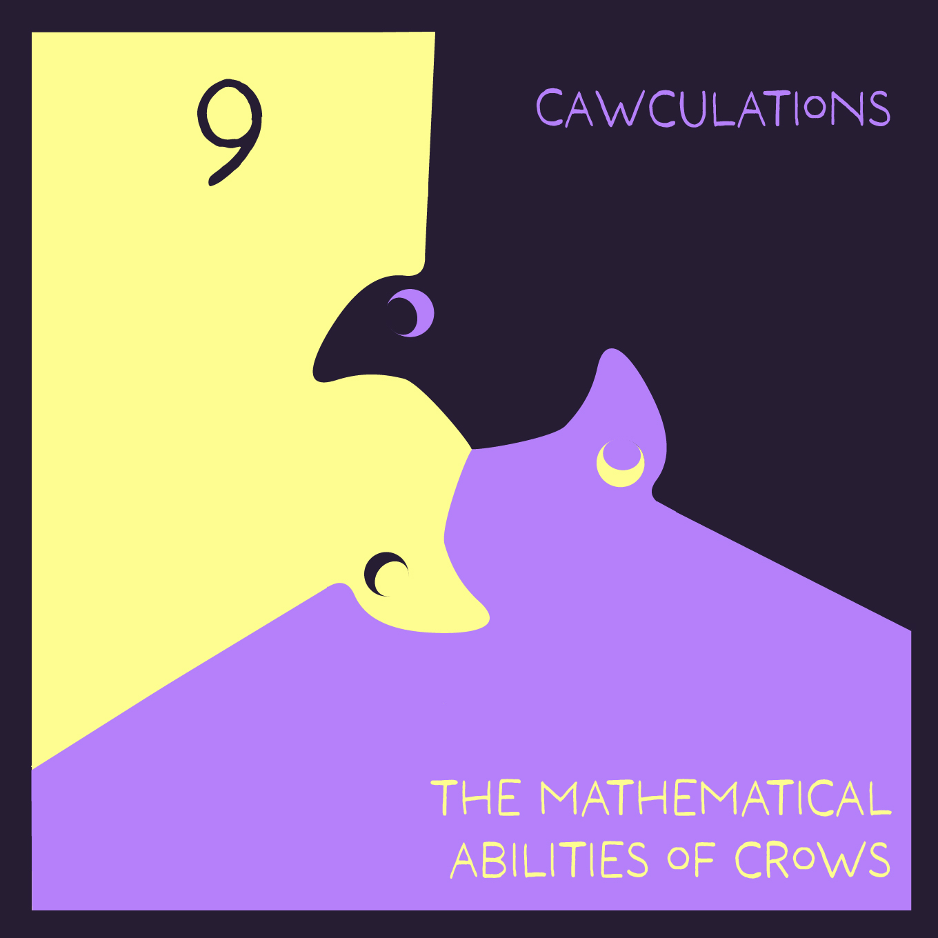
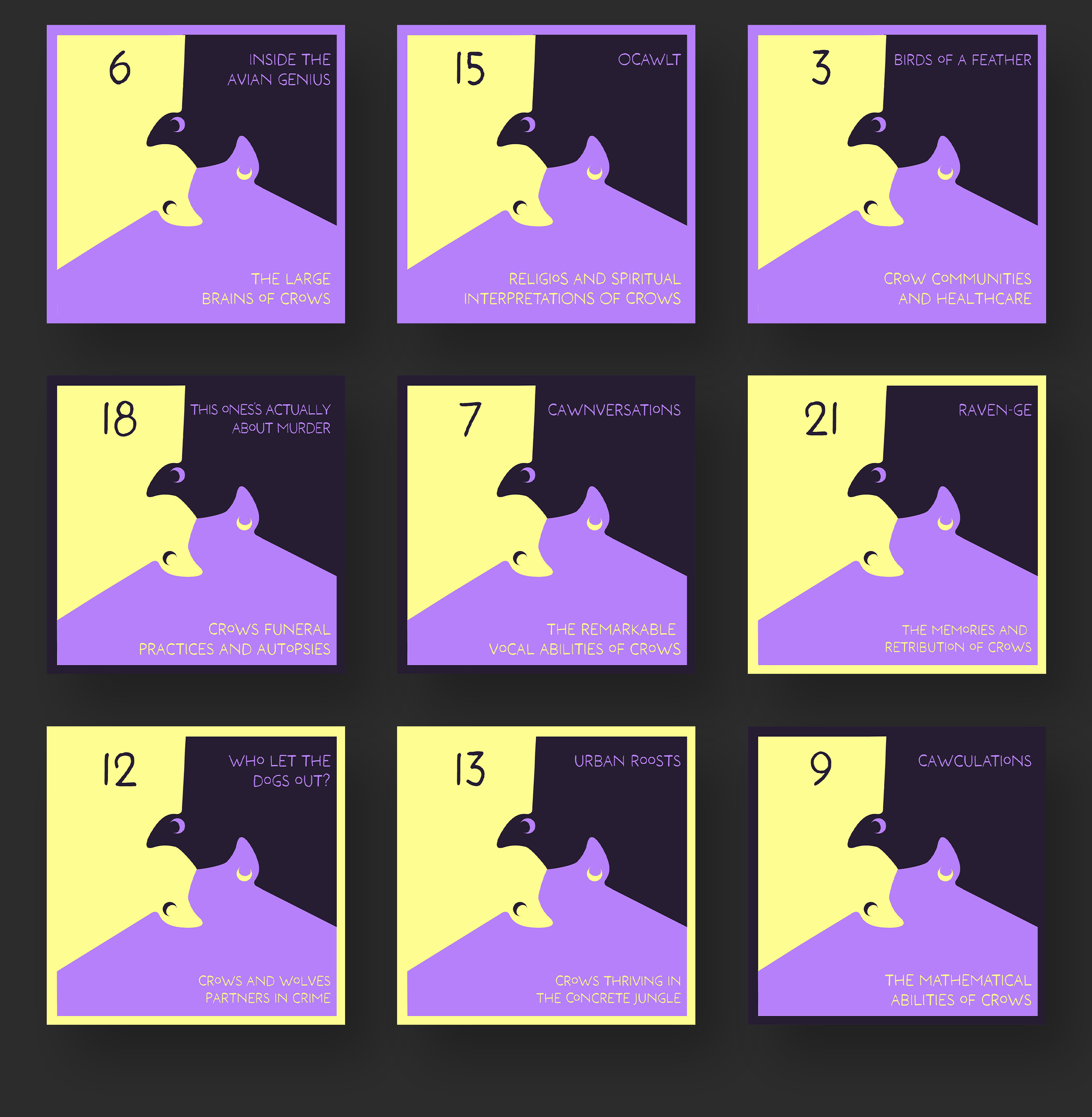
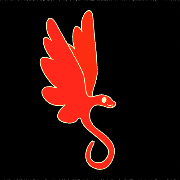
Design decisions: The primary design for the logo, and environmental graphics is a crow tessellation.
I decided on tessellation because it's adaptable and can be used across all deliverables, especially for environmental graphics. In addition, tessellations are often popular in academics due to their association with the union of art and mathematics. They're also based on religious art. These aspects of tessellations reference both the intelligence of crows and their association with spirituality and religion.
The font, color, and shape language were meant to be very cute and calming. This was done to subvert the name and common perceptions of crows as edgy or dark. The colors were also meant to allude to mysticism and the cycles of the moon, which in addition to the crescent moon eyes and three crows, is an allusion to The Morrigan, an Irish triple Goddess associated with crows, as well as Hecat,e a similar trinity Goddess associated with witchcraft and the moon. Both of which tie into the mythic aspects of Crows.


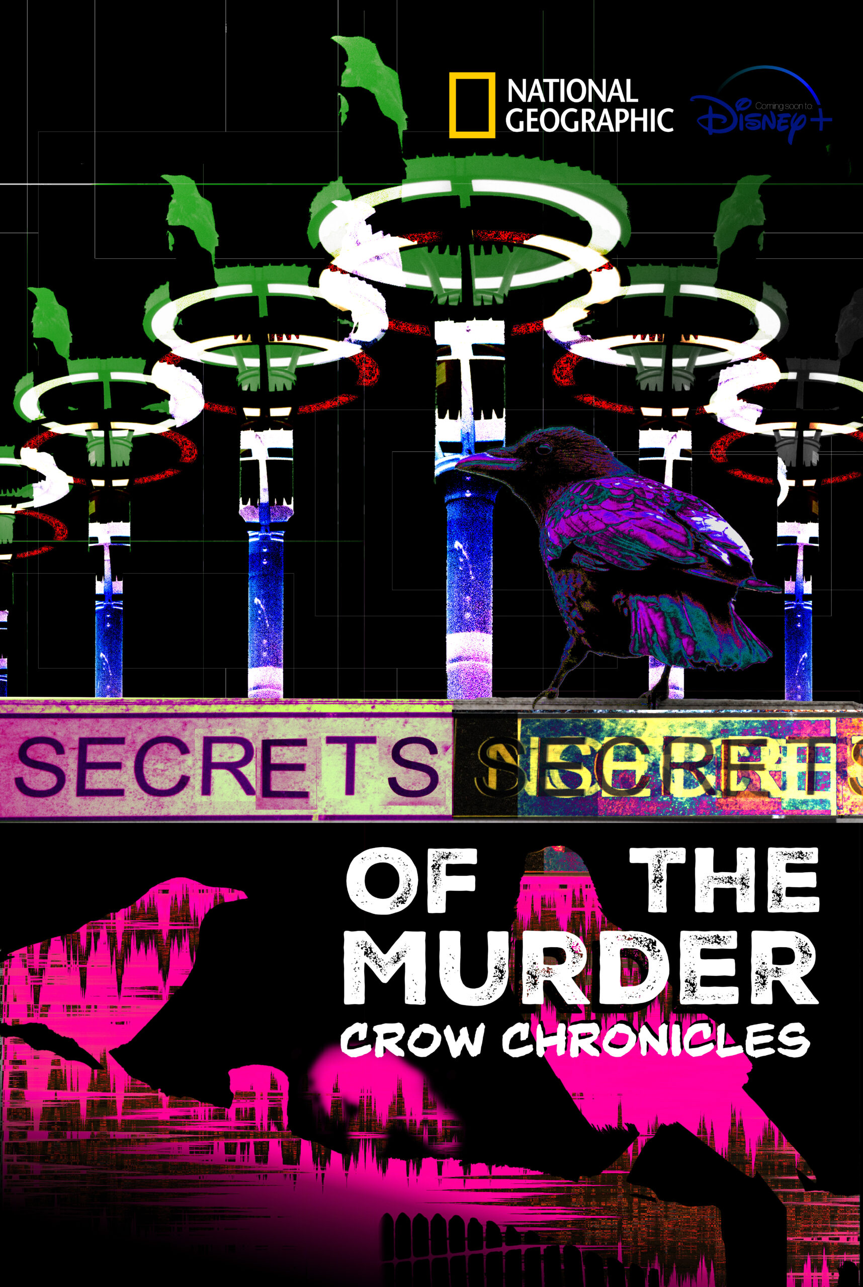
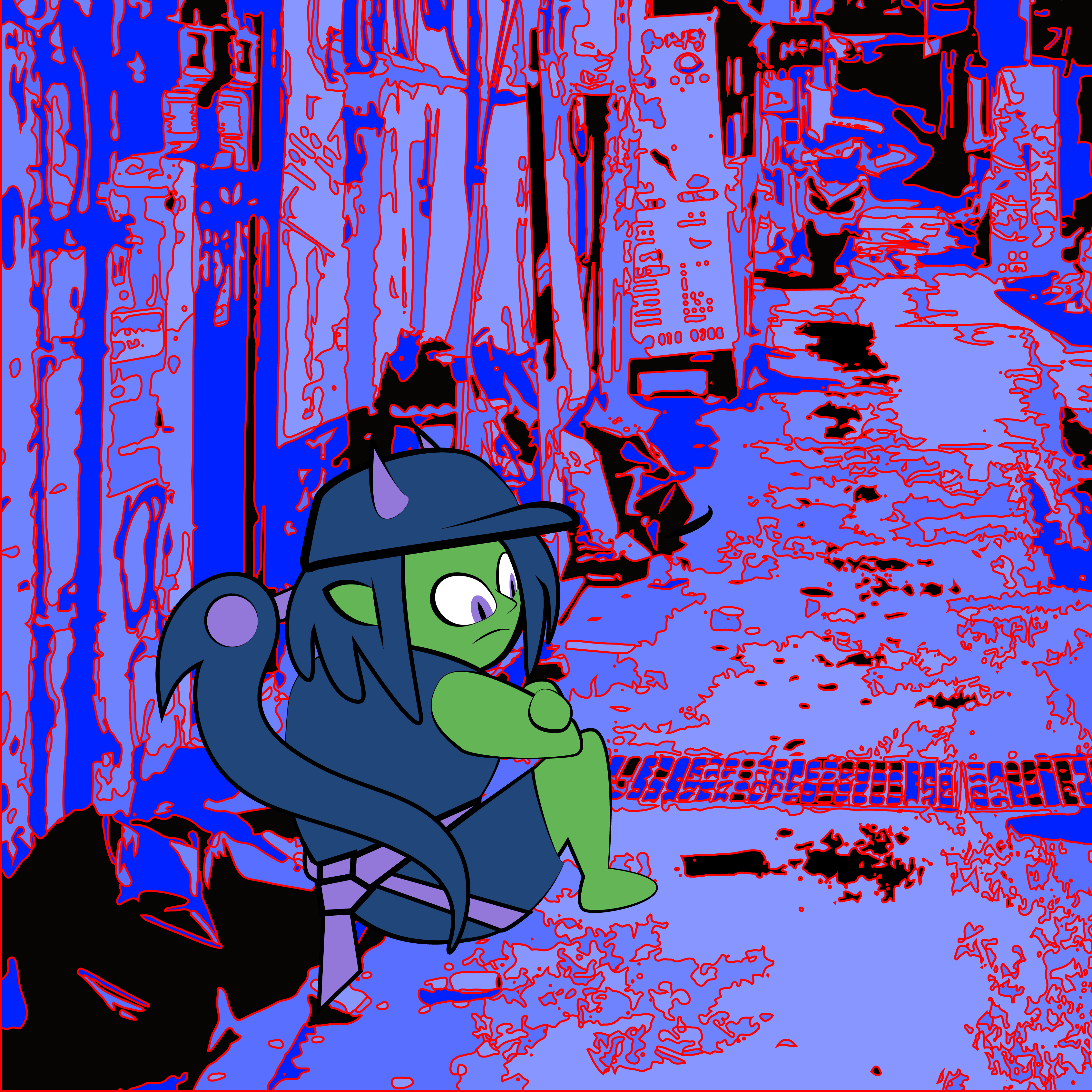
Design decisions, poster: For the poster, I wanted to lean into the joke of the name. Which was that the project was originally going to be a Serial-style (actual) murder podcast, but this idea was pitched as a play on that.
I did this by giving the poster a conspiratorial/mystery feel through the use of a lot of media tropes around the topic. I also did this to poke fun at National Geographic's competitor, the History Channel, and its association with aliens and conspiracy. It also plays into the secrets aspect of the show title and the idea that crows have their own world that we only ever catch glimpses of.
The placement of crows at the top alludes to a spy or government council often shown in movies and shows. The middle crow is meant to look like someone on guard looking over their shoulder. The foreground crows were meant to resemble a back alley where the viewer walked in on. The foreground, middle ground, and background with a clear hierarchy were meant to reflect layers of knowledge or conspiracy.
The digital-looking colors and collage feel were meant to reference the graphic styles of such shows and movies. Some graphic references include the sign which is collaged from cutouts to resemble the random note trope and the lights on the poles were meant to allude to UFOs and their association with conspiracy.
Other stuff:
Junction 432Logo design, motion graphics
Astere videreBrand identity
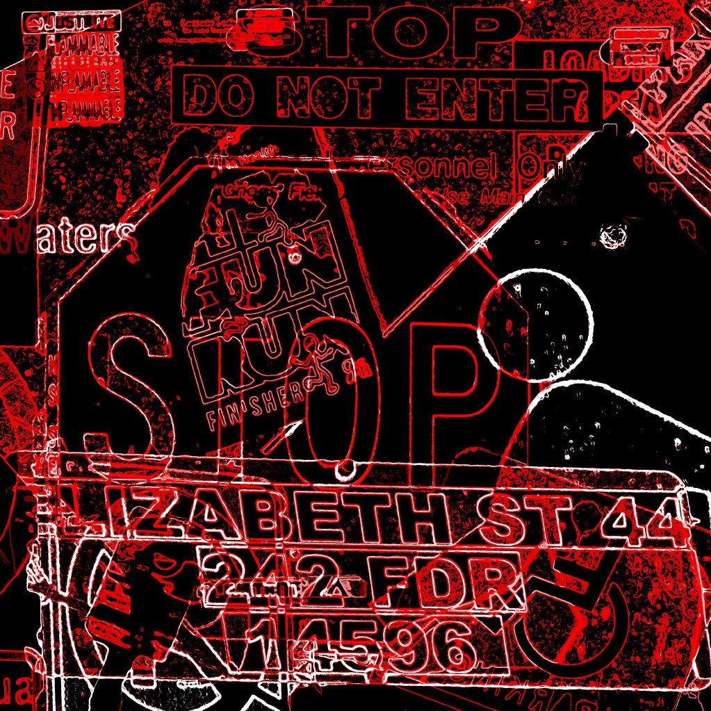
Photo EditingPhotography, Editing
Prague's DogsPackage design
The Air HousePoster design
Strange storyTypography
Etc.Project type
612 - 849 - 2804
If it's 1st time calling, please text or leave a message.
I do not usually answer unknown numbers, Thanks!