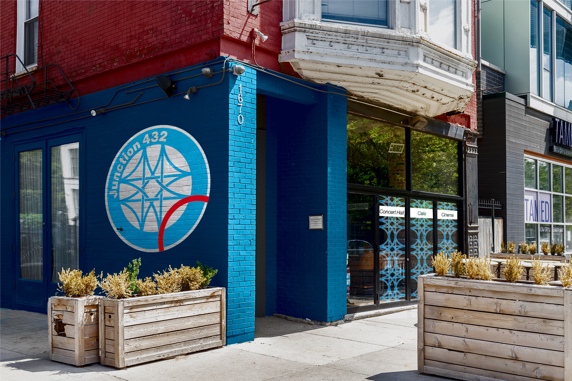
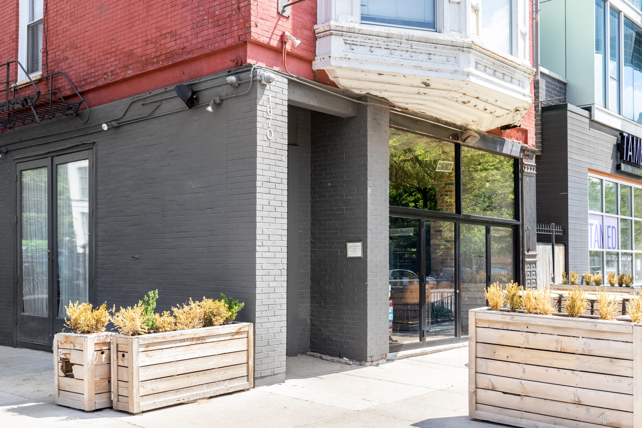
Brief: Consolidate three Chicago-based companies under a single name and unified brand. The Beanery (café), South Shore Sound (concert venue), and Loop Cinema.
Deliverables: A new name, a modular logo with three variants for each aspect of the brand, an animated logo and an exterior design.
Tools: Illustrator, Photoshop, and After Effects.

Old logos provided by Matt Olin
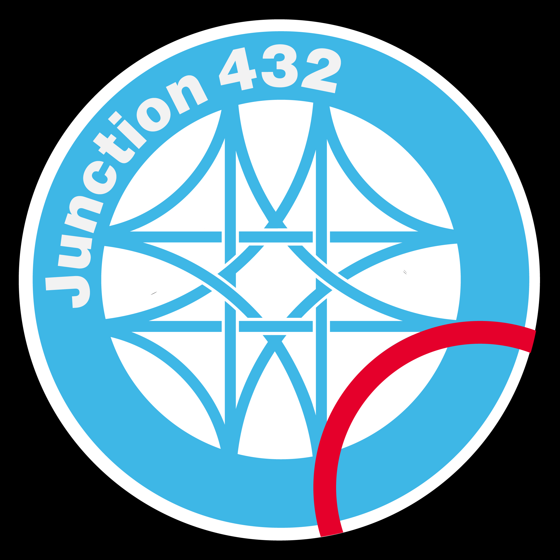
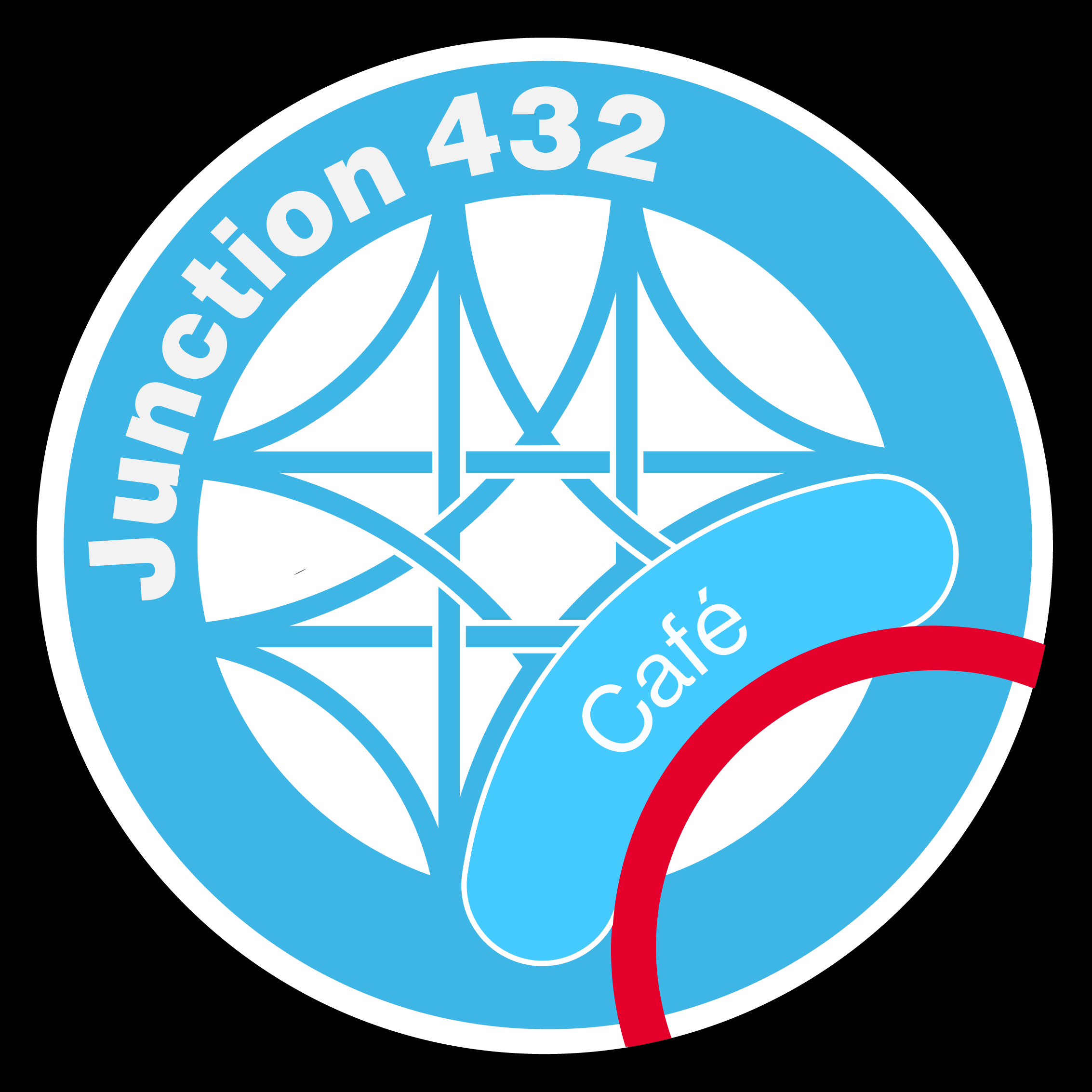
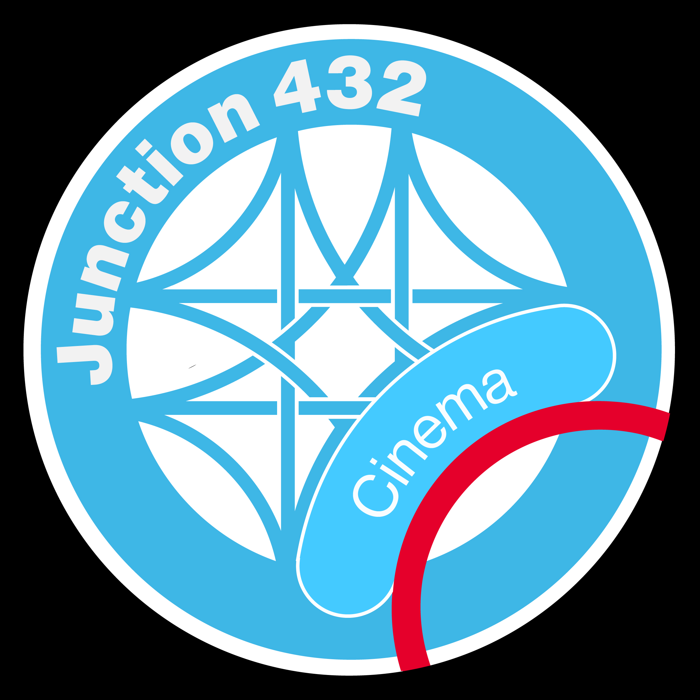
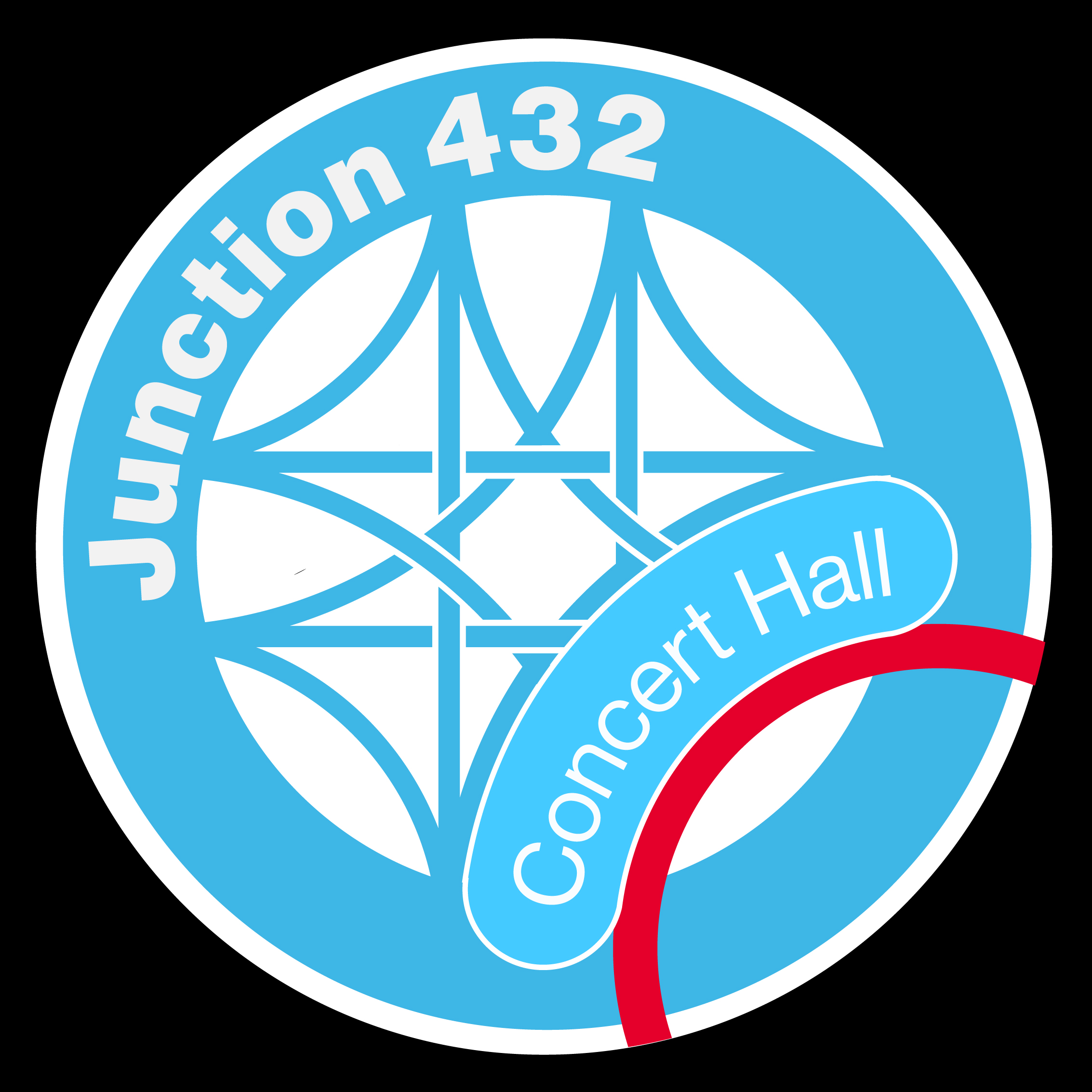
Design decisions, the logo: Liked the train motif, felt like it was a fun concept, culturally significant, and the junction concept worked well for the combination of the brands. The Base of the logo is a train junction in an interlocked pattern based on the Loop junction (which was once the busiest junction in the world). The font choice was also picked to resemble the one used for Chicago public transit (and 99% of everything because it's Helvetica).
The shape of the abstracted train carrying the type was based on the bean.
The colors were blatantly taken from the Chicago flag (which I double-checked were not copyrighted). The red line is also a specific reference to the L train's Redline which goes between the Loop and the South Shore.
Other stuff:

All About MurdersBrand identity
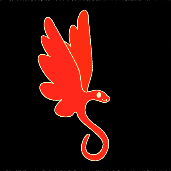
Astere videreBrand identity
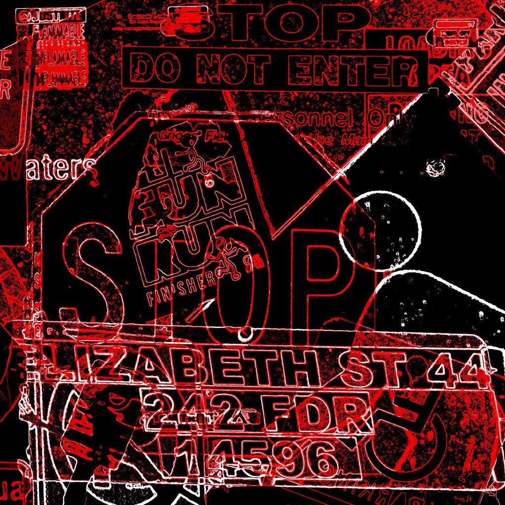
Photo EditingPhotography, Editing
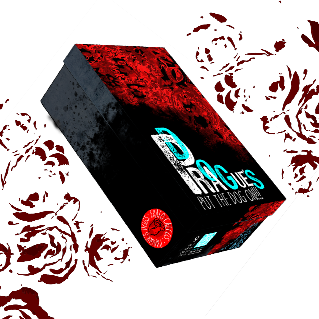
Prague's DogsPackage design
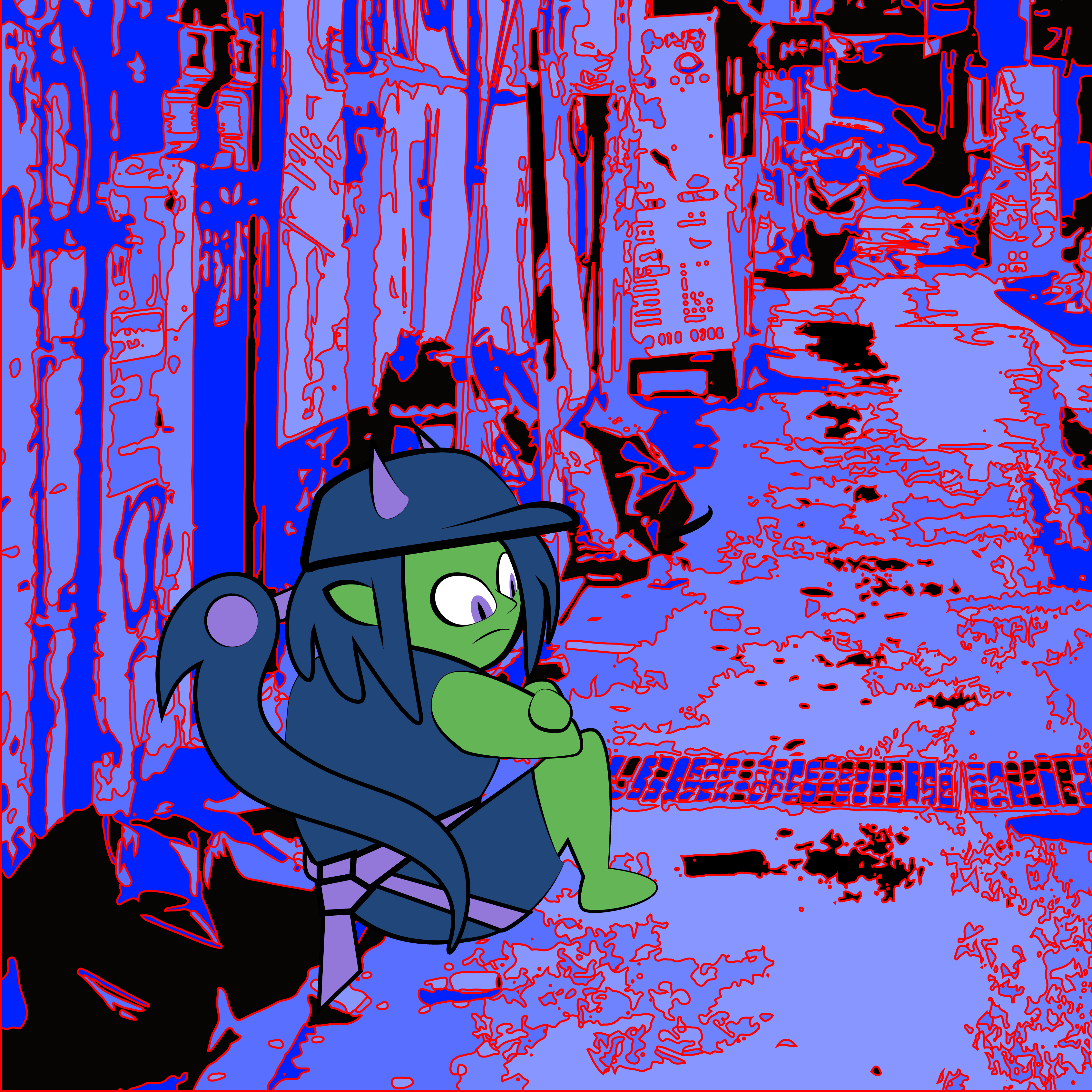
The Air HousePoster design
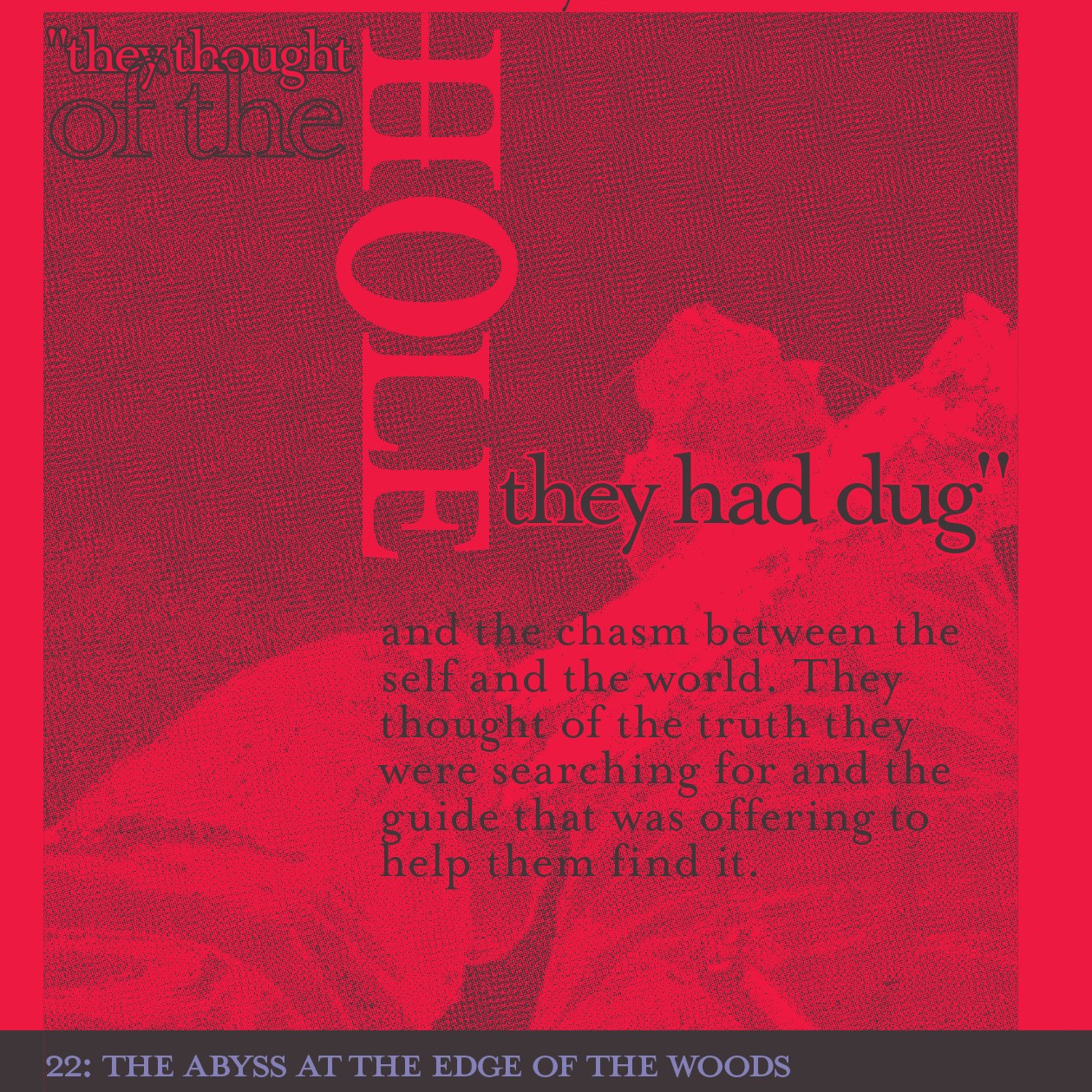
Strange storyTypography

Etc.Project type
612 - 849 - 2804
If it's 1st time calling, please text or leave a message.
I do not usually answer unknown numbers, Thanks!